Tiny introduction to heatmaps
Heatmaps can be used for website usage analysis. They appear to be very easy to read and comfortable to understand. But in fact it's not that easy to assure a proper environment and to get reliable results.
My TYPO3 agenda today was hit by heatmaps, when a click-heatmap extension was published in TER and a german blog posting about heatmaps was published by Tim Lochmüller. At the time of writing this post I will not refer to the extension as it did not meet my personal quality requirements. Well, so what about heatmaps?
What are heatmaps and how are they generated?
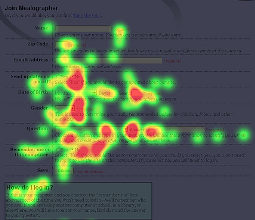
There are different ways of heatmap data generation. I will explain two of them in context of website usage analysis. The first one is a click-heatmap which tracks the coordinates of all mouse clicks users perform on a website. The second one is an eyetracking-heatmap, which tracks the eye movement of a user when he looks at a website. Both methods use colorization to visualize those areas where user clicked or looked at. The more clicks an area has or the more time was spend for watching an area, the more reddish the area is colorized. The visualization follows assumptions of the color theory, which associate red colors more hot than blue ones. So hot areas on heatmaps reveal more user attention than cold ones.

Click-heatmap usecase
A click-heatmap gives an impression about the regions of a website users click - no matter if there's anything to click or not. Heatmaps therefore are very useful to identify usability flaws. They reveal those parts of a website, where users expect something to click, but in fact nothing exists to click. A popular example are those huge logo images at the top of a website, where you could expect a link to the root page. In fact you often click in vain.
Eyetracking-heatmap usecase
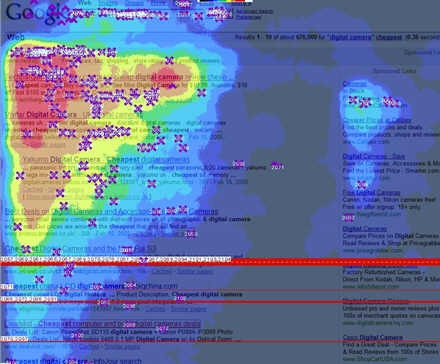
Heatmaps also can be used to describe users' eye movement and favorite coordinates on a website. Jakob Nielson demonstrated this by creating heatmaps which proof the so called F-pattern. He describes the F-Pattern as a dominant scheme how users track a website. His heatmaps revealed a F-shaped area, where users looked most frequently at.

The image shows an F-Pattern heatmap on a google search result page.
Why not simply install a heatmap software to find out what users behave like...
You need to be sceptical about the obvious nature of a visual representation like a heatmap:
- In the wild, websites users have different tools and interfaces which render your wesbite differently. Screen resolutions or size and browser rendering can vary and bias the results of a heatmap survey. The more diverse user environments are, the more bias your results will have. And in most cases it is hard to estimate the bias.
- Content changes, especially on dynamic root pages with latest news. The quality of heatmap results declines the more frequent content changes or the longer a survey takes on a dynamic website.
Conclusion
A heatmap is a handy tool to visualize website usage. It's results are real eyecatcher. The reliability of the results can suffer very much if you are not in full control of the users environment. The perfect usecase would be a website usability pretest with controlled laboratory conditions. Heatmaps are no substitution to visitor or website traffic statistics, but can cast light on some hidden aspects.
Comments
There has been a new release of a click-heatmap extension which looks promising. It's called Heatmap for Websites (heatmap_pro) and integrates the GPL software ClickHeat.